
今天我们想向大家展示如何创建一些具有特殊3D外观的纯CSS进度条。不妨将本教程当作是一个高级的CSS练习,以更深入地了解更多有趣的3D属性和着色技术。仅使用CSS创建UI组件将训练你的创造性思维,并且在本教程中,我们将通过制作进度条并动画化来向大家展示一些如何创建更复杂形状的技巧。
注意:某些CSS属性仅在现代浏览器中受支持。IE仍然不支持transform-style:preserve-3d,这是一个用于创建嵌套3D结构的关键属性;所以进度条在IE浏览器中将是扁平/无效的。
浏览器支持:Chrome Firefox Internet Explorer Safari Opera

源码下载(http://www.html5tricks.com/jquery-css3-3d-progress-bar.html)
我们将在本教程中使用Sass(与Compass一起使用),因此请确保设置并了解其基础知识:
- 安装Sass和Sass Basics
- 安装Compass Stylesheet Authoring Framework和Compass CSS3
如果你想对动画进度条使用完整的解决方案,那么你应该查看Kimmo Brunfeldt的ProgressBar.js或HubSpot的PACE,以获得出色的页面加载进度条。
为了生成所有必要的前缀,你可以使用像Autoprefixer或用于Sublime Text的插件。
我们将使用许多有趣的CSS属性,如transform,perspective和box-shadow。我们还将大量使用SASS,以节省生成进度条的位置和外观所需的很多时间。通过使用相对大小(em,百分比),我们可以确保进度条的大小易于调整。
构建面
我们先从构建一个包含所有六个面的框开始。这个框将作为我们的主要容器,用来设置进度条的尺寸及其视点。我们还将使用一个包装器用于透视图,并且这个包装器的font-size属性将允许使用某些em单位魔法的帮助来扩展进度条。
为了确保所有的面都是我们3D空间的一部分,我们需要将transform-style: preserve-3d应用于框。
所以让我们从初始化一些颜色变量开始来编写样式吧:
$light–gray: #e0e0e0;
$magenta: #ec0071;
$white: #f5f5f5;
.perspective {
font–size: 5em; // sets the main scale size
perspective: 12em; // sets the perspective
perspective–origin: 50% 50%;
text–align: center;
}
.bar {
display: inline–block;
width: 1em;
height: 1em;
margin–top: 1em;
position: relative;
transform: rotateX(60deg); // sets the view point
transform–style: preserve–3d; // perspective for the children
}
现在,我们来看看这些面。如果我们想要能够毫无困难地重新调整我们的主框,里面包含的面必须得像液体一样具有流动行为以及具备绝对位置。
.bar {
// -> The SCSS written before
.bar–face {
display: inline–block;
width: 100%;
height: 100%;
position: absolute;
bottom: 0;
left: 0;
background–color: rgba($light–gray, .6); // just to see what is happening
}
}
写标记并且确保它是可以访问的:
<div class=“perspective”>
<div class=“bar” role=“progressbar” aria–valuenow=“0” aria–valuemin=“0” aria–valuemax=“100”>
<div class=“bar-face”/>
<div class=“bar-face”/>
<div class=“bar-face”/>
<div class=“bar-face”/>
<div class=“bar-face”/>
<div class=“bar-face”/>
</div>
</div>
如果你有兴趣了解更多有关可访问性的信息,这篇文章(由Gez Lemon撰写)帮助我了很多: ‘Introduction to WAI ARIA’
设置面
这是非常重要的一部分。进度条的面必须准确定向,这样当我们开始添加百分比填充时,就不会陷入困境。
.bar {
// -> The SCSS from before
.bar-face {
// -> The SCSS from before
transform-origin: 50% 100%;
&.roof {
transform: translateZ(1em);
}
&.front {
transform: rotateX(-90deg);
}
&.right {
left: auto;
right: -.5em;
width: 1em;
transform: rotateX(-90deg) rotateY(90deg) translateX(.5em);
}
&.back {
transform: rotateX(-90deg) rotateY(0deg) translateZ(-1em);
}
&.left {
width: 1em;
transform: rotateX(-90deg)rotateY(-90deg) translateX(-.5em) translateZ(.5em);
}
}
}
<div class=“perspective”>
<div class=“bar” role=“progressbar” aria-valuenow=“0” aria-valuemin=“0” aria-valuemax=“100”>
<div class=“bar-face roof”/>
<div class=“bar-face front”/>
<div class=“bar-face left”/>
<div class=“bar-face right”/>
<div class=“bar-face back”/>
<div class=“bar-face floor”/>
</div>
</div>

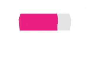
好的,这是一个很棒的立方体,但是我们要为进度条创建一个矩形。如果你还记得的话,我们已经用一种液体化的方法构建了面,所以如果我们只是增加.bar类的width,那么这样就可以。在这个例子中,我们使用了4em的宽度。

构建百分比填充
百分比填充将包含在面内,并且,为了保持HTML代码的最小化,我们将使用伪类:before。这样生成的:before元素将显示相对于面宽度的百分比。
.bar {
// -> The SCSS from before
.bar-face {
// -> The SCSS from before
&.percentage:before {
content: ”;
display: block;
position: absolute;
bottom: 0;
width: 0;
height: 100%;
margin: 0;
background-color: rgba($magenta, .8);
transition: width .6s ease-in-out;
}
}
}
<div class=”perspective”>
<div class=”bar” role=”progressbar” aria-valuenow=”0″ aria-valuemin=”0″ aria-valuemax=”100″>
<div class=”bar-face roof percentage”/>
<div class=”bar-face front percentage”/>
<div class=”bar-face left”/>
<div class=”bar-face right”/>
<div class=”bar-face back percentage”/>
<div class=”bar-face floor percentage”/>
</div>
</div>
现在我们需要编写百分比填充样式。手动编写一百个类将会非常繁琐,所以让我们写一些可靠的循环来从HTML中获取aria-valuenow属性的所有值。
.bar {
// -> The SCSS from before
.bar-face {
// -> The SCSS from before
}
@for $i from 0 to 101 {
&[aria-valuenow=’#{$i}’] {
.percentage:before {
width: $i * 1%;
}
}
}
}
如果你想立竿见影地看到成果,那么只需将HTML中的aria-valuenow属性从0更改至100。
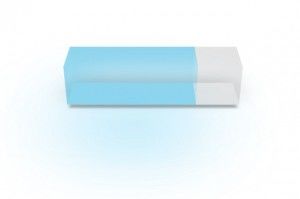
构建皮肤
为了构建皮肤,我们将使用Sass mixins。为了得到一个现实化的外观,我们将使用box-shadow属性。这个属性支持一个数组的值,并且这个数组将允许我们模拟照明。我们将在这个属性中包含地面阴影和面的采光。
@mixin build-skin($color, $name) {
&.#{$name} {
.floor {
box-shadow:
0 -0.2em 1em rgba(0,0,0,.15),
0 0.2em 0.1em -5px rgba(0,0,0,.3),
0 -0.75em 1.75em rgba($white,.6);
}
.left {
background-color: rgba($color, .5);
}
.percentage:before {
background-color: rgba($color, .5);
box-shadow: 0 1.6em 3em rgba($color,.25);
}
}
}
.bar {
// -> The SCSS from before
@include build-skin(#57caf4, ‘cyan’);
}
<div class=”perspective”>
<div class=”bar cyan” role=”progressbar” aria-valuenow=”75″ aria-valuemin=”0″ aria-valuemax=”100″>
<div class=”bar-face roof percentage”/>
<div class=”bar-face front percentage”/>
<div class=”bar-face left”/>
<div class=”bar-face right”/>
<div class=”bar-face back percentage”/>
<div class=”bar-face floor percentage”/>
</div>
</div>
此外,我们需要一个照亮面的技巧。如果我们以正确的顺序输入面的DOM节点,我们将看到奇迹:
<div class=”perspective”>
<div class=”bar cyan” role=”progressbar” aria-valuenow=”75″ aria-valuemin=”0″ aria-valuemax=”100″>
<div class=”bar-face roof percentage”/>
<div class=”bar-face back percentage”/>
<div class=”bar-face floor percentage”/>
<div class=”bar-face left”/>
<div class=”bar-face right”/>
<div class=”bar-face front percentage”/>
</div>
</div>
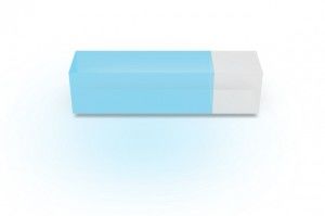
这里发生了什么?很简单:当浏览器渲染一个绝对元素时,默认情况下它会添加一个自动递增的z-index(如果我们不编辑此属性的话)。所以,如果我们通过先放置底部的面来改变渲染顺序,那么它的阴影就会覆盖在背面的所有面上。这就是我们实现现实化阴影的原理。
关于如何实现进度条就都在这里了!现在,请查看所有DEMO演示和源代码文件,然后开始构建皮肤来训练自己此技能吧。
感谢各位的阅读,希望本教程能对你有所帮助!
- 随机文章
标签云集
-
APP UI设计
react
网页设计
数据库
交互设计
vue
APP设计参考
adobe
图标设计
前端开发
zabbix
jupyter
移动端识别
linux
ui设计
android
docker
前端技术
Redis
设计教程
python
app设计
iphone x
k8s
docker命令
swoole
golang小技巧
python插件
docker的使用
vue小技巧
PHP小技巧
树莓派
php
mysql
设计灵感
javascript
MySQL小知识
页面设计
mysql优化
logo
分布式
css
大数据可视化
JavaScript小技巧
nginx
webpack
Java
electron开发
docker小技巧
ios


